
UX Design
Data analysis
Year
Jan-2020
Karen Ferreira – UX Design
Andrigo Oliveira – Visual Design
Scenario
Our client was a website for a vacation club. The focus was not to sell the club through the website, but to support the sales team with useful information.
The site was not performing well, with few accesses and few leads. Our assumption was that users were not finding the necessary information about the club. So we needed to understand exactly what user’s pain points were.
Data and Hypotheses
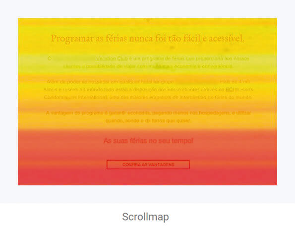
By analysing scrollmaps and clickmaps, we were able to understand the most critical pain points in order to create hypotheses. We observed that:
1. Users spent a long time checking the club’s perks (in yellow and red) and clicking on the button (CTA — Call to action) ‘perks of the program’.
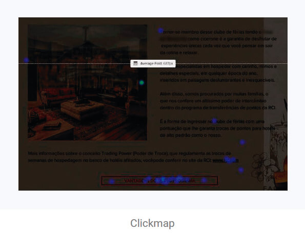
2. Users spent a long time on the contact page, mainly concentrating on the whatsapp number. Our assumption was that they were writing down the phone number or copying the email address.
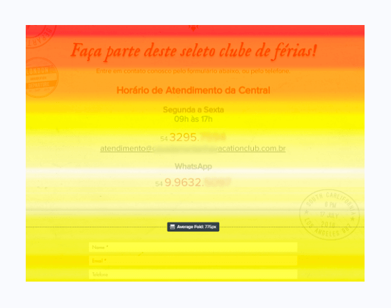
White, the hottest color in this heatmap tool, shows that users have spent a long time on email and whatsapp number.
Data
triangulation
To increase the accuracy of the hypotheses, an advisable practice is to combine data from different sources. We used data from Analytics, which helped us realizing that the ‘frequently asked questions (FAQ)’ page had the highest average duration of visit. This is probably because users had several questions about the program.
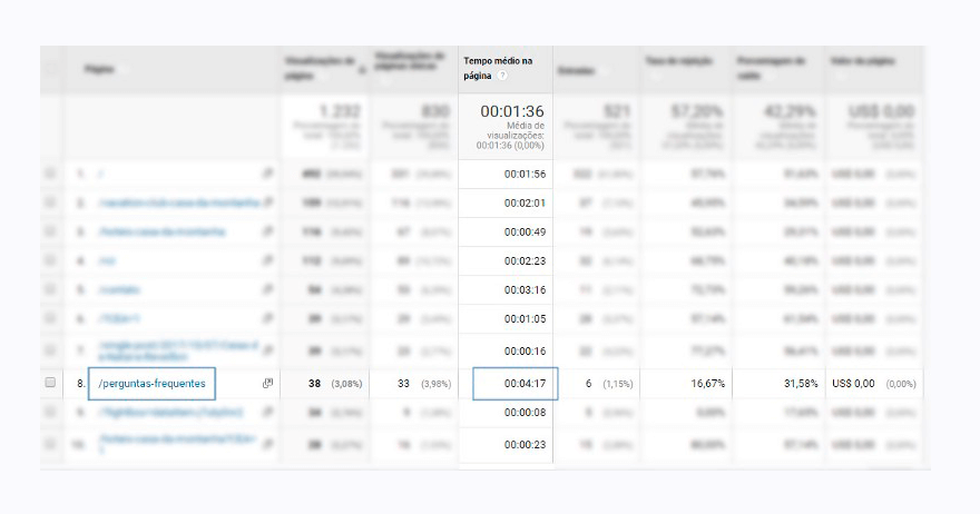
Google Analytics data, which helped us understanding that the ‘frequently asked questions’ page was the one with the highest average visit time.
Solutions
We decided to start by creating a wireframe to represent the information architecture that would fit the users’ needs. We came up with these main solutions:
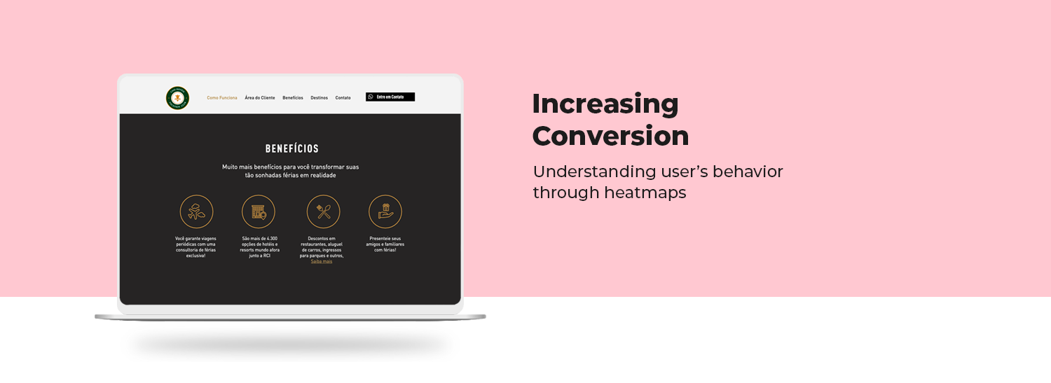
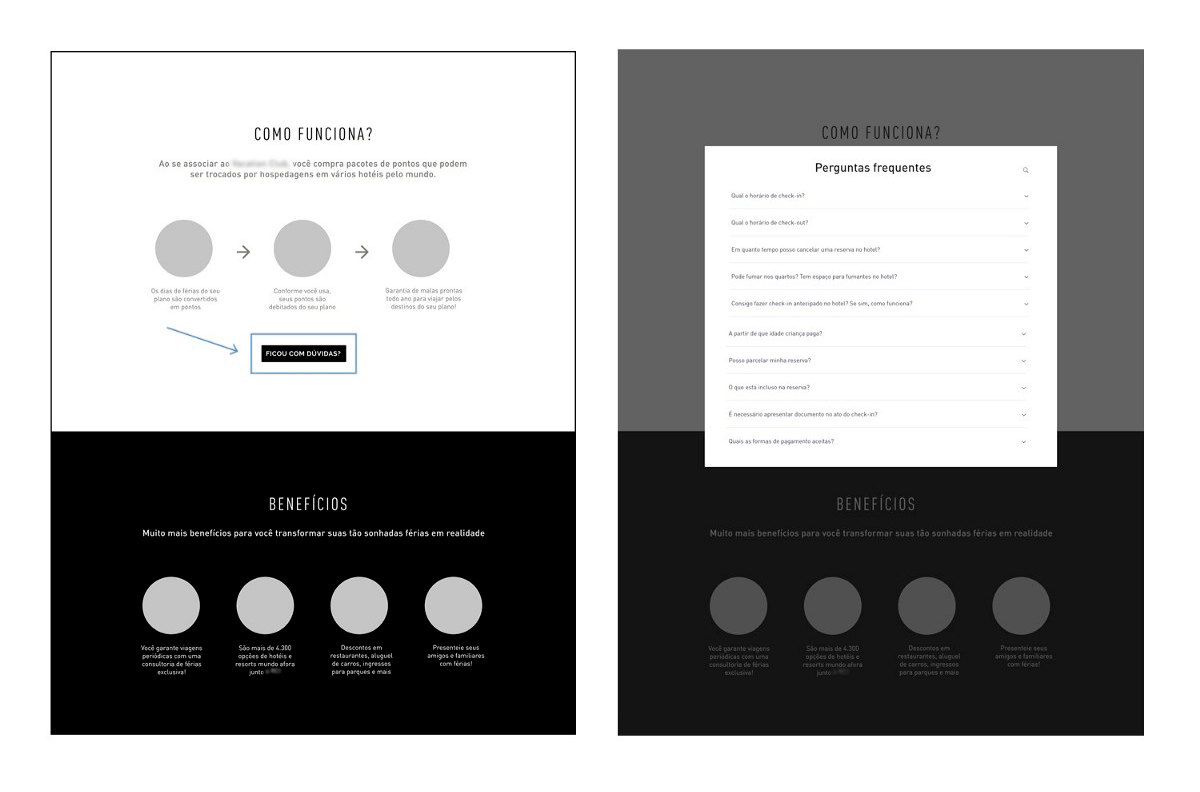
1. Divide the long texts on perks into two, smaller sections: ‘how it works’ and ‘benefits’. Within the sections, we briefly explain, by using iconography, how the program works and, subsequently, its benefits. Within the ‘How it works’ section, we’ve put a CTA ‘Got questions?’, which opens a lightbox with frequently asked questions. This change solves two problems at once and prevents the user from having to switch pages to read frequently asked questions (FAQ).
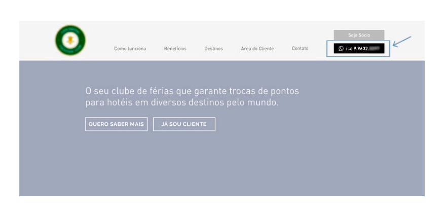
2. Sticky CTA button in the menu that leads directly to whatsapp. This solution prevents the user from having to write down the number, reducing the time it takes to get in touch.
3. Capturing qualified leads
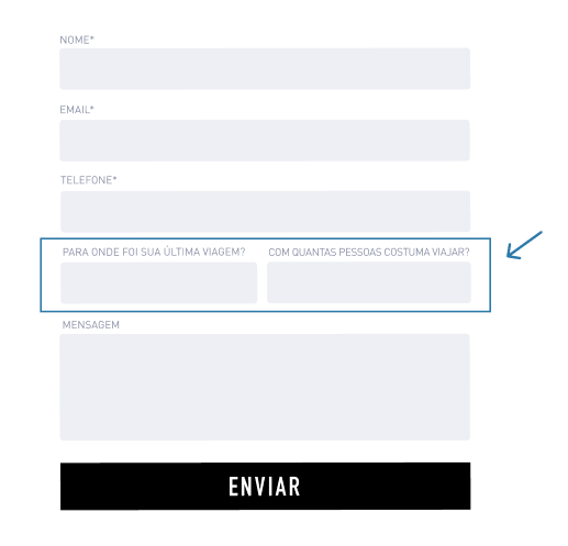
We saw the opportunity to capture qualified leads by improving the contact form. With the addition of the field ‘What was your last travel destination?’ it is possible to have an idea of the user financial situation. In addition, the field ‘How many people do you usually travel with?’ indicates whether he is a family traveler.
By collecting these two data points, we were able to understand the audience’s background and focus on the main target: families with high purchasing power who love travelling.
These were the main points observed through the heatmaps tools used in combination with data from Google Analytics. Now the next step is to adapt the website according to our hypotheses and prototype so that we can measure the results.
Our hypotheses will be validated if we see an increase in sales and if we see that the mapped users’ pain points were minimised substantially. For example, if we have an increase of contacts directly through whatsapp.
Learnings & Insights
USER’S ATTENTION IS AT THE TOP OF THE PAGE
Realizing through the scrollmap that most users do not scroll all the way to the bottom. It confirms what the Nielsen Group study says: 74% of users viewing duration is spent on the two first scroll folds’. This means that the highest priority content must be at the top of the page (including the main CTA buttons) and the secondary information further bellow.
READING PATTERNS TELL US A LOT
Users spend more time looking to the left side of the screen than to the right. That’s because they go through the pages scanning the information with their eyes, usually forming a ‘F-Pattern’, which is a reading pattern adopted by most people on the web. This shows us that placing very large blocks of text is not a good idea. The ideal is to always break the information with titles, subtitles or topics, so that the process of visual scanning is simplified.