Project
Brief
Passion project developed during the User Experience course at 4ED school of design. I chose to tackle the problem of car rentals, having in mind that it’s an industry that has so many painful touch-points with users.
The goal of the project was to fight complexity and bureaucracy through a new business model, design and technology. Helping users that want to rent a car with ease, free of the headaches of the underlying and unspoken dark patterns that car rentals historically have.
Understanding
I’ve conducted user surveys via Google Forms and followed-up with semi-structured user interviews to take an in-depth look at the problems and opportunities in this area.
THE PROBLEM
Classic rental companies usually operate in an counter-intuitive model, deceiving users to gain advantages. This is, in my opinion, a bad business strategy and a shot in the feet in the long run.
The interviews showed that once the users find out that they were victims of the “dark patterns”, they’ll never use their services again. It repels users with awful experiences and bad feelings. It probably has a great impact on the success metrics of these companies, once the customers will not refer their products (bad NPS – net promoter scores).
Main user’s pain points:
- Price as a decisive item but it’s often added with underlying fees
- Bureaucratic and time-consuming process
- Divergencies between the online price and the moment of actually getting the car.
- Inflexible hours to get and return the car
- Poor transparency of insurance coverage
THE NEED
Rent a car without bureaucracy, with transparency prices, fees, and insurance. From the moment of reserving to returning the car to the owner.
Design
Challenge
How might we connect users that are looking for renting cars for a shorter period of time and car owners that want extra income? Leveraging the sharing economy as an easy way to give access to mobility.
User
Journey
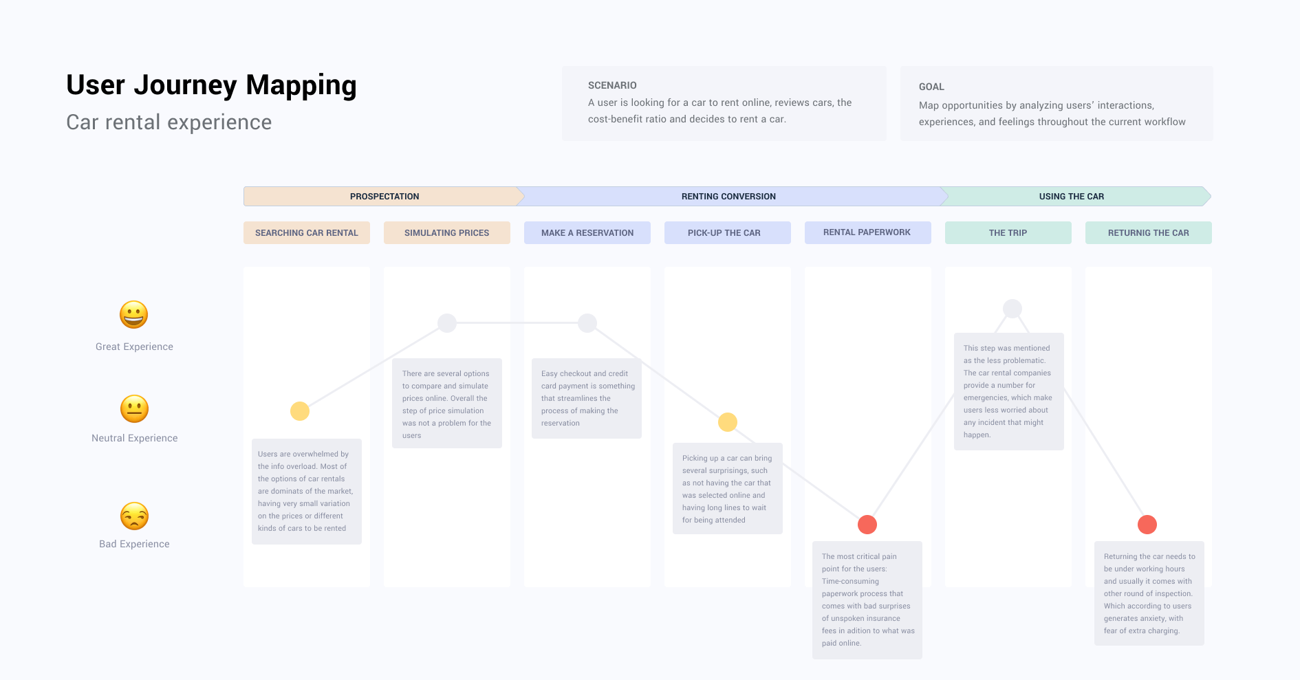
To better understand the pain points and opportunities during the whole process of a car rental, I’ve conducted an online survey and semi-structured interviews. It involved aspects such as the search, the analysis of the cars and prices, the most important items while choosing a car to rent.
As a way of analysing and documenting, I mapped the user journey to give visibility to all touch-points with its problems and opportunities.
Users
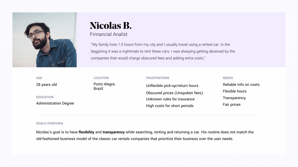
There are two main actors in the process of sharing economy for car rentals. 1. Users who want to rent a car at fair rates, without paperwork of the classic car rentals business models (main focus of the project). 2. The owners of cars aiming to have an extra income by renting it during the periods it’s not being used (e.g.: a car standing in the garage while the owner is traveling).
The
Solution
An app that connects car owners to people who need a car temporarily. Utilising the concept of sharing economy to solve classic experience problems of the car rentals industry.
Prototyping
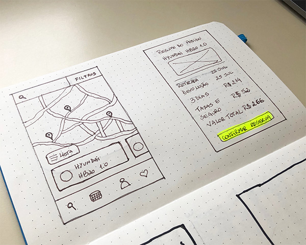
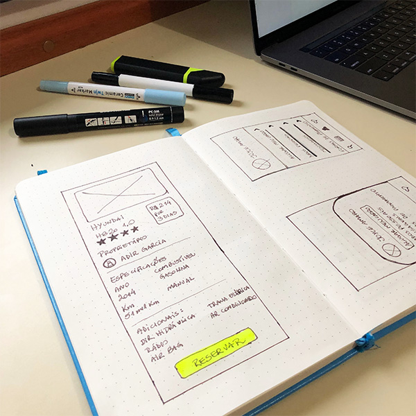
Low-fi sketches to get a general idea of what the interface would look like. Creation of alternatives based on the hypothesis that was raised in the discovery phase.
*The main focus was on the person that would rent the car, having in mind that the car owners would have another solution to solve the problems on their side of the experience.
Searching for
the right car
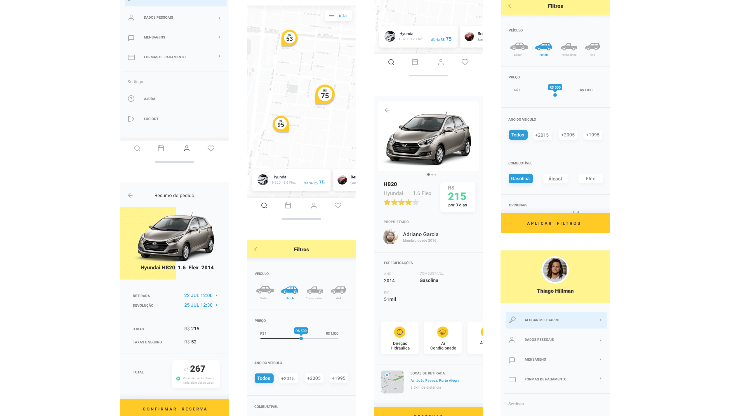
During the interviews, most of the interviewees mentioned that the price was the most decisive item. Having that in mind, the interface presents the final daily price of the rental, along with the current car’s location compared to the user’s location. Apart from the map view, I created the list view that allows easy and fast comparison between the available options.
Reservation
Funnel
The reservation is the most business & user critical moment of the interaction. The main idea here was to build trust with users through the transparency of prices, insurance rules and pick-up/returning hours. The main pain point the users mentioned during the interviews was the obscured prices and underlying fees that they were always concerned about. For this reason, I created a visual element along with the final price to communicate that the user won’t be surprised with other fees in the future.
Learnings & Insights
LETTING USERS LEAD THE WAY
The user research phase was a game changer to avoid assumptions and focus on the real needs of the users. Also, it helped me to better understand the universe of both actors involved in the process.
PRIORITISING REAL NEEDS
In an industry that for several years have put the business before users, there are a lot of experience problems to be solved. Mapping all different touch-points was crucial to have the big picture and prioritise which problem to focus on first.
UNDERSTANDING THE COMPETITIVE LANDSCAPE
Some design decisions may seem obvious to a designer, but they may not be so obvious to users. The user research and analysis of the competitive landscape of similar solutions such as Moobie, Turo and Drivy helped me identify the main usability issues.
PREVIOUS PROJECT
